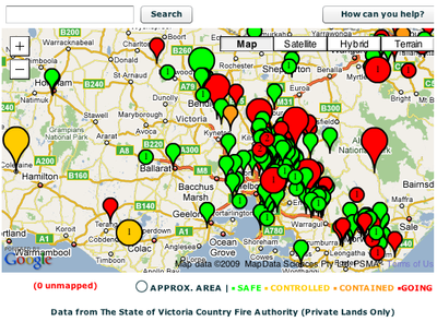
I just spoke a few minutes ago at BarCamp Canberra 2 about our experience making a map of the Victoria BushFires. Here's a quick run-through of the presentation, with links:
- We woke up, saw there were crazy fires going on, and looked at how we could help. The websites with the information were DSE (Public Lands) and CFA (Private Lands). The problem with the DSE site was the lack of an interactive map and the lack of an RSS feed. The lack of RSS feed meant that people were constantly reloading the page to see what had changed, and their server was crumbling under the load. The problem with the CFA site was the lack of a map -- and given all the number of small towns in Australia, it's very hard to visualize where the fires are happening in respect to where you or your loved. The problems with the RSS feed was that it lacked latitude/longitude coordinates, and the CFA website was struggling and producing corrupt feeds some of the time.
- First we tried using Yahoo! Pipes to turn the RSS into a GeoRSS feed, but it didn't quite work correctly, and we were worried about relying on the service during an emergency.
- So then I set up a database on my server, ran a script geocoding any new locations every 2 hours, output the database as an ActionScript object, copied and pasted it into my Flex app, and re-uploaded the SWF. It was ghetto and painful, but it worked.. provided I woke up every 2 hours. Sometimes, we had to manually find locations - like "DSE - 6KM ESE OF WARBURTON" - by using the distance measurer mapplet in Google Maps and eyeballing it. It sure would have been easier if CFA had done the geocoding for us!
- So then we created the map. We sent the RSS feed through Google App Engine, caching it every 5 minutes to avoid hitting the CFA web server (and to ignore corrupt feeds), parsed that feed in the Flash map, and displayed the fires as markers. We later added a legend, search box, and colored/sized markers, but we basically had our map up 4 hours after we started coding. Not bad!

- One important thing we did was make a gadget version of the map. This meant news agencies, blogs (like Mashable, and random concerned folks could embed the map in their sites. A lot of people discovered the map through the gadget, and the news agencies benefited since they didn't have to create their own visual to complement their articles.
- The map got around 60 QPS at its peak - and App Engine handled it with no problems. It probably helped that we used our inside influence to raise all of our quotas to the absolute max (14 petabytes of bandwidth!). :)
- After we had the map up, we wanted to make the geocoding less ghetto. We changed from doing the geocoding on my server to doing the geocoding on App Engine, and outputting the feed as a GeoRSS feed instead. The great thing about GeoRSS is that it's a pseudo-standard, and there are multiple websites that can parse and display them (including Google Maps). The cool thing about outputting the data in this portable format was that one concerned guy was able to import the GeoRSS into a Google My Map, plot markers where his family members were located, and figure out if they were in trouble.
- At this point, we were doing good things with the CFA data, but we still had no data for the public lands. DSE was unwilling to give us structured XML data, as they had various concerns about copyrights, attribution, and data distortion. We still wanted to represent public lands data though, and that's when we discovered that NASA takes satellite imagery of South Australia every 12 hours and makes them available in various standard formats.
- Using MapTiler, an open-source GUI for the command line GDAL utilities, we converted the NASA GeoTIFF into map tiles. Those map tiles can be used in most APIs - Google, Microsoft, OpenLayers, etc. We, of course, overlaid them on our Google Flash Map, and let people toggle the imagery on. NASA does an automatic analysis of the imagery to look for fires, so you could actually see red outlines around the center of big lines of smoke. Since we're still serving the imagery from 25 days ago, you can still see that on the website.
- The aftermath of all of this is that we learned lessons about the issues with getting emergency data in a format that can be re-used, cached, syndicated, and visualized in useful ways. We wrote a white paper of sorts with recommendations for Emergency Data portability and we're consulting with various agencies to help them get their data up to snuff.
2 comments:
I observed Pamela do this presentation at BarCamp Canberra2, and have to say I was absolutely gob-smacked at the speed with which the solution was created, its inventiveness in terms of creating a easily understood visualisation of a complex situation through the use of various known protocols and geocoding standards, and its use of widely adopted mechanisms (like RSS) to support scalability (even if she cheated a bit with the Google App-engine limits).
I'm roundly impressed, but the real story is just how powerful the tools out there can be when deployed by smart people.
Hi Pamela ,
Great presentation - it really demonstrated how making public data available enables the community to work together to support themselves. Access is power.
I will be flagging your post in my blog next week.
Post a Comment